Work · Case study
Making the law accessible with a user-first design approach
PebbleRoad designed a website for a client in the legal industry using content strategy and design thinking to help laypersons access the law more easily than before.
- Design
- Transformation
- Content

Summary
- A client from the legal industry had embarked on a transformation journey.
- It wanted to shed its image of being imposing and complex.
- A key obstacle was its three websites that presented a fragmented and frustrating experience for users.
- PebbleRoad designed a unified website that presented relevant information and spoke the language of users, making the law more accessible, more empathetic and less intimidating.
The Challenge
Recently, a client from the legal industry embarked on a transformation journey in anticipation of disruption from globalisation and rapid technological advances.
They also wanted to shed the image of being an imposing and complex entity while at the same time encouraging access to justice for the layperson.
The client had three entities (with distinct websites) that served an overlapping audience. This created a fragmented user experience as some users had to visit more than one of the websites to obtain information, perform transactions or inquire about services. However, the content was not easily understandable, leading to frustration among users.
Adding to this was the changing demographics of the users. They were more tech-savvy and better educated than before, with greater access to legal information and awareness of the avenues to seek recourse. However, this meant a risk of users obtaining inaccurate and misleading information from other sources .
To address these challenges, the client commissioned PebbleRoad in 2020 to create a single source of “truth” for their users.
The Approach
Our initial research confirmed users’ frustration, anxiety and confusion. Not only were the web pages dense and full of legalese, they had “textbook” replies that were unhelpful. This led users to seek answers elsewhere, from calling the entities’ hotlines to browsing other organisations’ websites.
This poor experience resulted from a production mindset (“I’m done when I have produced the content”) where information was organised organisation-centric.
This way, users did not need to know the entities’ entire workings in order to access the law; they just needed to identify with the task they wanted help with.
Thinking like a consumer, not a producer
We proposed the client to adopt a consumption mindset (“I’m done when my readers have satisfactorily consumed the content”) instead.
Before the revamp, users had to first know where to begin:
Where it needs to be done → What needs to be done → How it needs to be done
We proposed to start the user journey with tasks instead:
Tasks that users needs to complete (“jobs to be done”) → What needs to be done → How to do it
This way, users did not need to know the entities’ entire workings in order to access the law; they just needed to identify with the task they wanted help with.
Hence the problem statement was: How might we make it easy for users to find and understand information on a single website so that they can complete a task or make informed decisions?
Design principles
With the client, we drew up design principles to guide the project, including:
- Be user first, not client first
- Give one experience, not three
- Give answers, not just information
Content strategy
With content at the core, the PebbleRoad team, which comprised two content strategists, did the following:
- Attended crash courses on legal topics with subject matter experts
- Conducted an audit of the existing content on the three websites
- Identified reusable content patterns and content types
- Proposed an information architecture-centred on user tasks
- Wrote user-first content
- Ran weekly content critiques with experts to ensure content edited or introduced is complete, neutral and legally accurate
- Conducted content usability tests to achieve a Flesch Reading Ease score of at least 60 (i.e. content easy enough for an average adult to read)
Agile way of working
The website was launched in three beta phases, presenting users with a choice of accessing the beta site when they visited the original three websites. This reduces risks and avoids a situation of “complete failure” as each phase provides feedback from actual users and an opportunity to identify blind spots. We learnt on the go, ascertaining market fit and user needs in an agile manner.
Co-teaming
We did not want to build a stagnant website that would need another revamp in three years. Instead, we wanted to the client to develop in-house capabilities so they can continue improving and evolving the website. This required a shift from a project mindset to a product mindset.
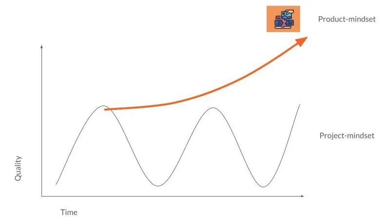
Product mindset focuses on constant improvements; project mindset focuses on creating new products
To this end, we worked with a client team to design and develop the website. This led to shared understanding and shared ownership of the decisions. There were also training workshops to impart knowledge (e.g. insights analysis, ideation, usability testing, measurements, content writing) to the client team. We hoped this co-teaming approach would sow the seeds for a sustainable future for the website.
Outcome
The mammoth task of combining three websites into one to deliver a unified user experience took nearly a year, albeit over three beta launches. The usability tests conducted with each beta launch validated what worked and highlighted areas for improvement.
“It states the course of action and what I need to do… this website assures me.”
Based on feedback, we iterated the information architecture and content design, and further simplified our writing. We were cheered by comments such as:
“There is more information available as compared to the current website, which wasn’t available previously.”
“It states the course of action and what I need to do, and this website assures me.”
“I like the boxes [timeline] on the right hand side, it helps me to navigate the website easily”
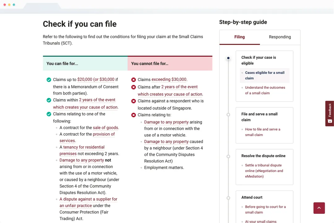
Eligibility checkers now allow users to know if they are eligible before starting a process.
The new website now has a simple query bar on its home page, with prompts to help users identify their “jobs to be done”. Some key highlights include:
-
Transparent process: Users had felt stressed when they could not understand long and complex legal processes. The website now has detailed process maps to help users achieve their goal in the easiest or fastest way.
-
Legal aid signposts: Previously, information on where to get legal aid was buried deep within the websites. Now, clear signposts and an intuitive user interface help users to navigate to the resources no matter where they are in the website.
-
Eligibility checkers: Eligibility criteria were not available before. Now, the user sees the criteria even before starting a process. Clear visual cues distinguish between the different sets of criteria (“you can file if …” vs “you cannot file if…”).